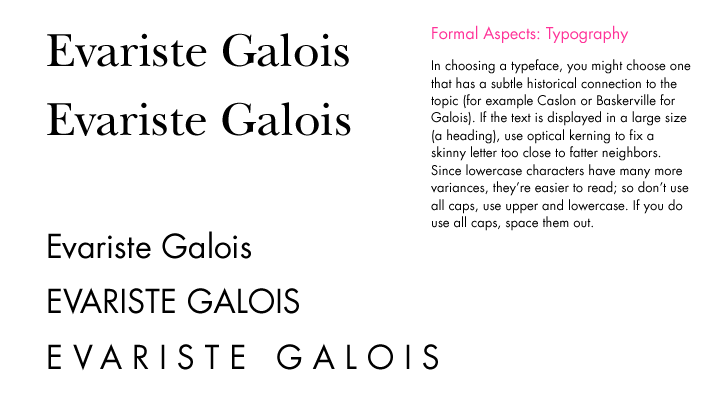
If
there's an historical link in your subject, you might choose a font from
that period. Here, it's Baskerville, from the mid-1800s, for Galois.
With large type, optically correct letterspacing around the fat and skinny
letters.
Since lowercase letters have more variances, they're easier to read. Using
all caps decreases readability. If you do use all caps, spacing them out
will make them a bit easier to read.
< previous | next > | | angelynngrant.com
1 : 2 : 3 : 4 : 5 : 6 : 7 : 8 : 9 : 10 : 11 : 12 : 13 : 14 : 15 : 16 : 17 : 18 : 19 : 20 : 21 : 22 : 23 : 24 : 25 : 26 : 27 : 28 : 29 : 30 : 31