author's note: Except where cited, all of the text in the slides that will appear in the panel above, as well as what will appear in this lower, black panel, was written by yours truly, Angelynn Grant. The difference is that the text below was my spoken script on June 15, 2001 (ddjustments for some spontaneous, onstage changes will be made later), and it varies enough in places that I've included it here. (Plus, you get that "You Were There" experience.)
If I were to have several hours, days or months, we (myself and you, my dear reader) could clarify, poke and prod the, at times, strident dogma presented here. But, since I was given the challenge of lecturing on design to a group of non-designers with just 10 minutes, this is what resulted.
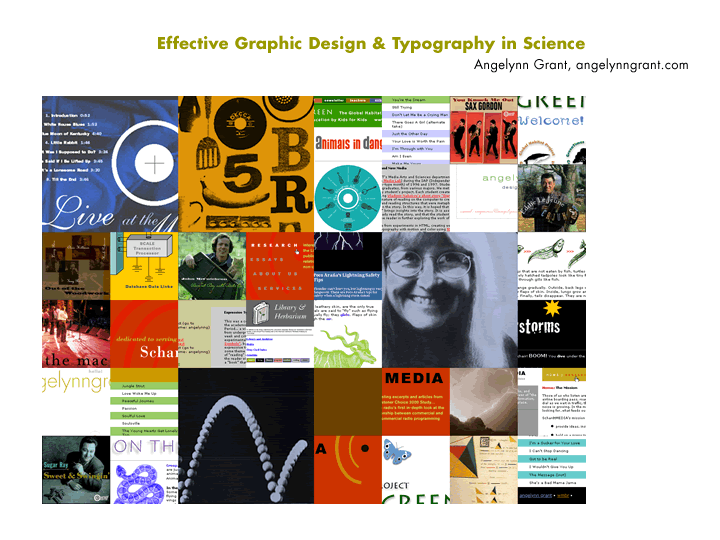
Hi,
I'm a graphic designer here in Cambridge.
I've decided to talk about conceptual approaches common in successful
scientific illustrations and to also go over some of the fine points of
good typography and layout. In essence, talk about diagrams from a formal
point of view (how they look) and a conceptual point of view (how they
communicate the concepts involved).
next > | | angelynngrant.com
1 : 2 : 3 : 4 : 5 : 6 : 7 : 8 : 9 : 10 : 11 : 12 : 13 : 14 : 15 : 16 : 17 : 18 : 19 : 20 : 21 : 22 : 23 : 24 : 25 : 26 : 27 : 28 : 29 : 30 : 31